Our Brand Name & Logo
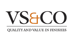
Our brand name – VS+CO – is expressed with a logo designed to reflect the strengths that our company brings to every customer and every project: superior quality, expert craftsmanship and unparalleled value.
Having served the business community since 1921, we’ve selected the classic Univers typeface, originally launched in 1954. The letterforms reflect our longevity, comprehensive but consistent range of project solutions, and impeccable reputation.
The Venetian Red ampersand is an unique element which, by combining an ampersand and a plus sign, symbolizes the pride, teamwork and dedication to employee engagement that distinguishes VS+CO from competitors.
A precise and straightforward charcoal gray rule is placed below the logo with the tagline -- Quality and Value in Finishes -- placed underneath the rule. This tagline emphasizes one of our key organizational goals: to ensure that for every customer and every project, the finished product is one of distinction and unmistakable value.


